Yes to
Increasing traffic for a growing natural skincare brand
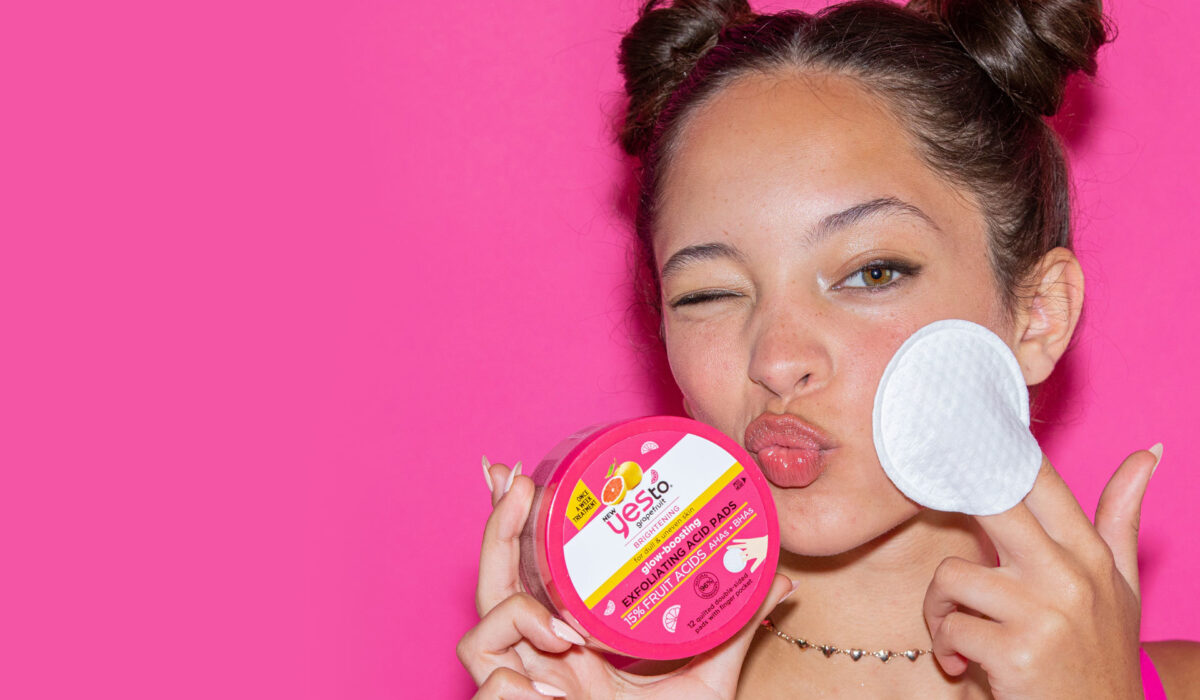
Made from 95% fruit and vegetables, vegan and cruelty-free, Yes To is the fastest growing natural skincare brand in the US. Sold in over 27,000 stores worldwide and with exciting plans for the UK, they needed their shop window to reflect their ethos and ambitions. We helped them tickle their underperforming website into shape, with a refreshed look and more engaging content.
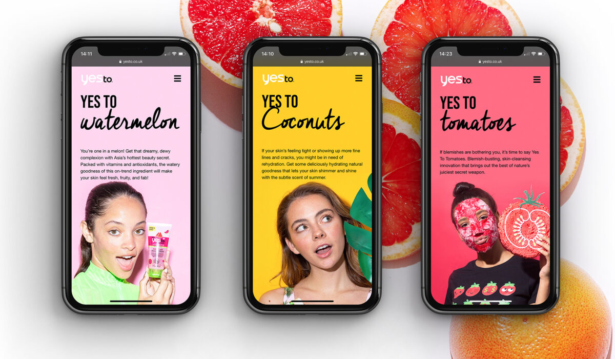
Interpret + Define
Every journey to improve site structure and performance begins with Google Analytics. Our initial audit of Yes To’s current website involved looking at key metrics such as number of visitors, bounce-rate, average page views and time spent on site to determine what need to be improved and set KPIs to achieve it.
Yes To’s initial report pulled up some interesting data. Whilst the brand was getting a good number of new users, the number of returning visitors was too low. This can be an indicator that the content isn’t engaging or sticky enough.
The ‘bounce’ rate – the number of people who visit the site, but don’t stick around – was too high, and the number of pages visited whilst on the site was too low. When people did visit, they weren’t staying on site for very long.
We also looked at what marketing channels were driving traffic, which devices people were using to access the site (mobile, tablet or desktop), and the demographics of our visitors. The data showed most traffic was coming from organic Google search via mobile users and that our Instagram campaigns were driving the most traffic.
Imagine + Create
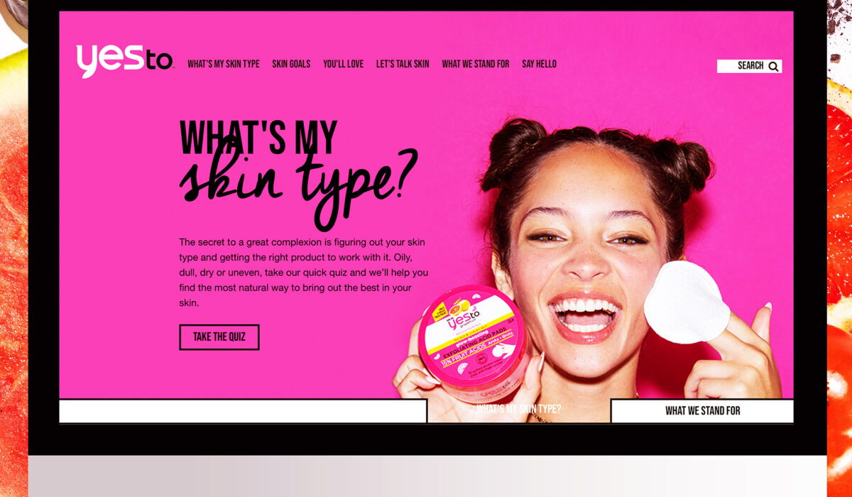
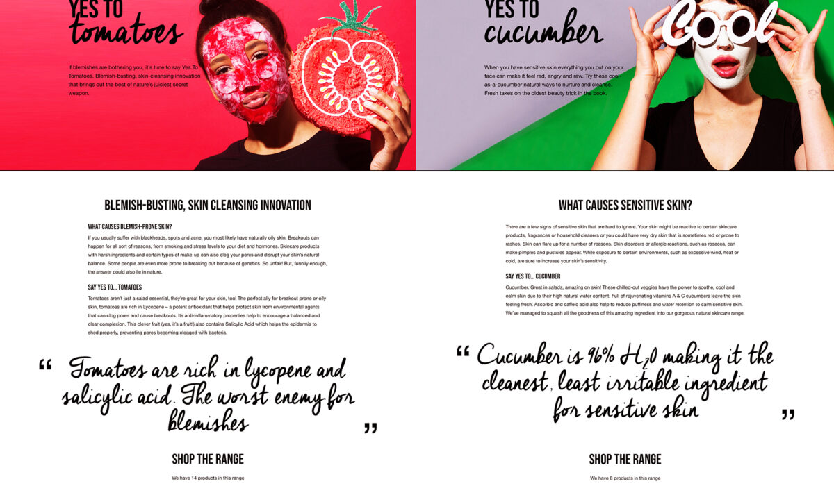
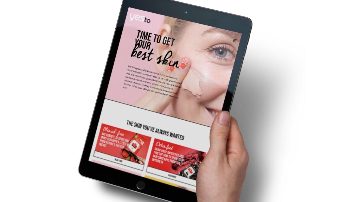
We looked at each key metric in detail and made recommendations on how to improve the site. To grow site traffic by 3% each month and improve engagement, we suggested a new site structure, based on Yes To’s existing template, but taking the user through a more targeted journey.
To help reduce bounce rate and keep people on the site for longer we recommended changing the homepage layout and structure, improving the site navigation, introducing clear CTAs on every page, and sorting out the overall site speeds.
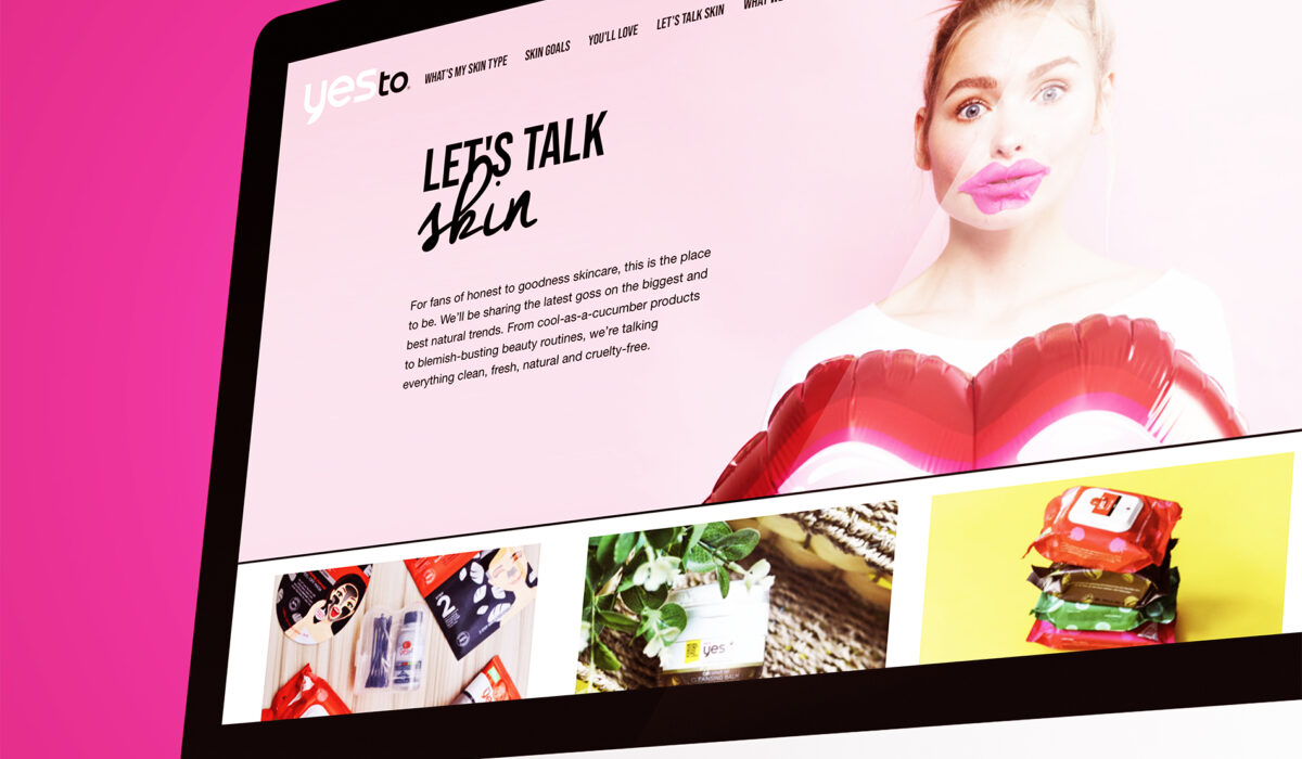
We knew, ultimately, the site would need richer and more relevant content. So, we also suggested adding new, engaging copy, product detail and supporting information to help people find the best natural skincare product for their skin. To measure our success after the changes had been implemented, we also set about defining some conversion metrics.
Rise + Shine
In the first phase of refreshing the Yes To website we saw some incredible results.
- Traffic to the site is up 53%
- Bounce rate is down by 11.3%
- Average views per session have increased by 10.8%
- Average session duration is up 10.3%.
We’ve seen a dramatic increase in search engine and social traffic over the last three months, 68% and 71% respectively, and we’ll be looking at increasing our social presence to drive more quality traffic to the site. Page views have also gone up by 77% and unique page views by 75%.
The new site structure has just been launched, adding improved content and imagery that is more befitting of a leading natural skincare brand. We will continue to monitor this over the next few months. If these initial results are anything to go by, we’re expecting great things from the next quarterly report.
Take a look at the website: www.yesto.co.uk